What the Font?
How a Typeface Change in the U.S. Government Highlights the Critical Importance of Visual Accessibility in the Workplace

In December 2025, the U.S. government sparked public conversation—not through major policy but through a change in typography. Secretary of State Marco Rubio revoked a 2023 accessibility-driven directive that had shifted the State Department’s documents to the sans-serif font Calibri. In its place, he reinstated the traditional serif font Times New Roman, citing a desire to “restore decorum and professionalism.” Critics argued that the shift walked back progress toward accessibility, particularly for individuals with visual impairments, and symbolized broader political resistance to inclusion-centered design.
Although fonts may seem like a small thing, typography is actually a mental health, accessibility, and workplace culture issue and the consequences show up every day in how people read, work, and feel.
As someone living with cataracts in both eyes, I pay close attention to how fonts, colors, and contrast affect my ability to read without strain. What many people see as “just a font,” for me, and for millions of others, is the difference between clarity and distortion, comfort and exhaustion, participation and withdrawal.

Why Fonts Matter for Accessibility
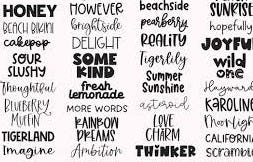
Fonts are not neutral design elements. They shape readability, comprehension, and cognitive load. When a workplace, government, or business chooses a typeface, it is choosing whose comfort is centered and whose needs are considered.
Research and accessibility guidelines emphasize:
Sans-serif fonts improve readability for many people with low vision, digital readers, and age-related eye changes. Their clean lines reduce visual “noise.”
Serif fonts such as Times New Roman, while familiar, can create crowding for some readers and are more difficult to parse on screens.
Contrast matters - dark text on light backgrounds is generally easiest for those with cataracts or glare sensitivity.
Font size and spacing dramatically affect comprehension and reduce visual fatigue.
Tools such as Section 508 standards and Web Content Accessibility Guidelines (WCAG) consistently prioritize simplicity, clarity, and contrast as pillars of accessible design.

The Workplace Impact: Culture, Stress, and Inclusion
Visual accessibility is deeply connected to workplace culture and mental health. When fonts or design elements cause strain, employees face:
Increased eye fatigue, headaches, and cognitive exhaustion
Slower reading speed and reduced comprehension
Heightened anxiety about missing information
Avoidance of written communication or screens
A subtle but real erosion of confidence and belonging
For those with cataracts, even well-intentioned design can create barriers. Certain colors bleed or halo. Thin fonts disappear. Serif letters smear into one another. A simple email or policy memo becomes work before you even get to the work.
When organizations select fonts and color palettes that prioritize accessibility, they create a climate that communicates:
“We see you. Your comfort matters. Your participation belongs here.”
That message contributes to psychological safety, which is essential for a healthy workplace environment.
Neglecting accessibility, on the other hand, sends the opposite message, even unintentionally. Accessibility isn’t just compliance. It’s culture.
A Small Change That Signals Something Bigger
When the State Department reverted back to Times New Roman, many people initially responded with humor, “a font war?” “does this really matter?” But underneath the surface, the strong public reaction revealed something important:
Typography is not neutral. Design choices are cultural choices. And cultural choices signal values.
A font is often the first line of communication in a document, policy, email, or presentation. When an organization chooses a font that is easier for more people to read - particularly people with visual impairments, neurodivergence, age-related changes, or learning differences - it quietly communicates inclusion. When it chooses a harder-to-read typeface for the sake of tradition or aesthetics, it communicates something else:
Access is negotiable. Comfort is optional. Clarity is secondary.
Even if that message is unintentional, people feel it.
Fonts as Micro-Policies of Inclusion
Workplace culture isn’t built solely on large, visible policies. It’s built on the micro-decisions everyday design choices that either expand access or limit it. Fonts, colors, line spacing, and contrast operate as a type of “micro-policy” because they determine who can fully participate and who struggles silently.
When visual design is accessible, it:
Reduces cognitive load, allowing people to think more clearly and engage more deeply
Decreases anxiety about misunderstanding important information
Supports neurodiverse readers who need clarity and spaciousness
Demonstrates cultural humility, especially for aging employees or those with visual conditions
Builds psychological safety, by showing that all forms of access matter
A workplace that prioritizes accessibility in communication sends a message of care, respect, and belonging.
Design Decisions Become Emotional Decisions
For many employees especially those with cataracts, low vision, dyslexia, or sensory sensitivity the wrong font or color scheme is not an inconvenience; it is a barrier. It can cause:
Eye strain
Headaches
Slowed reading
Irritability
Avoidance of written communication
Feelings of shame or inadequacy
These emotional consequences accumulate. Over time, inaccessible design can contribute to burnout, detachment, and decreased engagement.
In contrast, accessible design creates relief. Ease. A sense of being considered.
Typography Reflects Organizational Maturity
Modern workplaces increasingly recognize that accessibility is not just a compliance checkbox - it is a wellness practice, a leadership skill, and a strategic advantage.
Organizations that embrace accessible design demonstrate:
Emotional intelligence
Awareness of diverse bodies and abilities
Respect for the aging workforce
Commitment to well-being
Equity in communication
When something as “small” as a font is chosen with intention, it signals that larger issues of inclusion, climate, culture, and psychological safety are also on leadership’s radar.
The Bigger Picture: If We Ignore the Small Things, We Miss the Big Things
The decision to prioritize or ignore accessibility in visual design mirrors how an organization approaches more complex issues of equity, diversity, and well-being. If leaders overlook small, easy-to-change barriers such as font style, readability, and contrast it raises questions about how they might approach higher-stakes accommodations or cultural concerns.
Accessible design is a quiet but powerful measure of whether a workplace truly values the people it serves—not just the work they produce.
The font conversation wasn’t just about serif versus sans-serif.
It was about whose needs are centered, whose comfort is prioritized, and whose participation is assumed to matter.
And that is why fonts, that are simple, silent, and everywhere, signal something much bigger than letters on a page.

Practical Steps Toward Visual Accessibility
Organizations can demonstrate cultural humility and wellness-centered leadership by implementing simple practices:
✔ Choose accessible fonts
Calibri, Arial, Verdana, and Atkinson Hyperlegible are among the most accessible.
✔ Prioritize contrast
Dark text on light backgrounds is ideal for cataracts and general readability.
✔ Use adequate spacing
Line spacing (1.5), larger font sizes (12–14+), and generous margins reduce cognitive load.
✔ Conduct accessibility checks
Tools such as WCAG contrast analyzers ensure inclusivity.
✔ Ask employees what works
Nothing replaces listening. Accessibility is relational.
These are small changes that have large implications. People feel better, perform better, and engage more authentically when they aren’t straining to see.
Conclusion
Fonts shape experiences. They influence mental well-being, communication, and culture. They determine whether information feels accessible or obstructive. The recent U.S. government font shift is more than a headline it’s a reminder that accessibility must be intentional and that design choices send messages about who is considered and who is overlooked.
For those of us navigating visual conditions like cataracts, typography is not cosmetic. It is a matter of comfort, dignity, and full participation.
So yes, what the font?
Turns out, the answer is: quite a lot.
References
Associated Press. (2025, December 6). State Department reverts to Times New Roman, reverses Calibri switch. AP News. https://apnews.com/article/1fcdc92f8229efd515fe44ae9ca16137
British Dyslexia Association. (n.d.). Dyslexia-friendly style guide. https://www.bdadyslexia.org.uk/advice/employers/creating-a-dyslexia-friendly-workplace
National Institute on Aging. (n.d.). Vision changes with age. U.S. Department of Health & Human Services. https://www.nia.nih.gov
Rubio, M. (2025). Font requirements for State Department communications [Policy directive]. U.S. Department of State.
Section 508. (n.d.). Fonts and typography. https://www.section508.gov/develop/fonts-typography/
Siteimprove. (n.d.). Accessible fonts: How typography affects readability. https://www.siteimprove.com/glossary/accessible-fonts/
Sweller, J. (1988). Cognitive load during problem solving: Effects on learning. Cognitive Science, 12(2), 257–285.
Teaching Visually Impaired. (n.d.). Font legibility guidelines. https://www.teachingvisuallyimpaired.com/font-legibility.html
WebAIM. (n.d.). Fonts. https://webaim.org/techniques/fonts/
W3C. (2018). Web Content Accessibility Guidelines (WCAG) 2.1. https://www.w3.org/TR/WCAG21/
Wikipedia. (n.d.). Times New Roman. https://en.wikipedia.org/wiki/Times_New_RomanThe Verge. (2025, December 7). Calibri deemed “too woke”: State Department returns to Times New Roman. https://www.theverge.com